What are Web 2.0 Fonts?
The actual definition often varies from person to person, but generally in my own personal touch, I define it as simply a straight forward font incorporating curves into the typography that in most circumstances will use gradient / shading to produce a feeling of depth to the text. Often lighter and brighter colors will be used. So how does this translate to the overall shape and type of fonts used? To be quite honest, I don’t think there is necessarily a right or wrong answer, but there are a few types that you will see commonly in a lot of web 2.0 designs. You might look at them and see what they have in common. I have included a Sans serif font, but most of the time serif typefaces are preferred.
#1: Harabara
 Harabara is quite possibly the most popular Serif font available online for free. For good reason, it seems a lot of web 2.0 fonts and new logo’s are incorporating the other style of “a” into the logo’s. Instead of the capital “a” that many people use, the lowercase “a” used in Harabara has a distinct look that separates it from other fonts and gives it a new and more modern style and feel to it. Also, you will notice that facebook, twitter, and several other newer websites have set the tone for web 2.0 design. Do you see the similiarity between the r’s in Harabara and the “f” in the facebook logo? You will see that pre-shortened r that is becoming increasingly popular in typography design. Harbara also has a very bubbly look to it, giving it a feeling it is more modern than it is classic. The curved corners gives just enough tastefulness to give it a professional feeling, but also enough difference to make it feel custom and unique from your Arial or Verdana fonts.
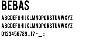
#2: BEBAS
 BEBAS is an interesting font for a lot of people. Some people would say that it doesn’t necessarily reflect what I placed in my definition as a good “web 2.0” font. It doesn’t necessarily have the swoosh, but the clear cut letters, all in caps is often a good indication of a good web 2.0 font as well. Look at the facebook logo, it is all in lowercase. Look at NIKE, an all caps logo in most circumstances. While typeface is important in web 2.0, sometimes the type itself isn’t intended to be the focus, and BEBAS allows for other design elements to take presidence but give a good platform for providing shading and gradients to the font since it is thick and bolder than most other typefaces.
#3: Optimus Princeps
 I included Optimus Princeps because it is a very popular Sans serif font. I think what you will find is that most sans serif fonts have a very elegant feel to them and Optimus Princeps is no different. The benefit to it is that it does have a little bit of swoop to the typeface in the way the letters are constructed. For example, the width of the “O” on the sides (if there is such a thing in a circle), is slightly thicker than that on the top and bottom. Many of the other letters have small swoops built into the bases of the type, making it have a little bit more of a web 2.0 style. A lot of sans serif fonts don’t always have that, they have a more blocky look and that translates closer to a more classic style at types in sans serif fonts than the serif styled fonts.
 Cheapest Linux VPS Home for Cheap Virtual Private Server

